A Practitioner’s Guide to Managing Your Business with Real-Time Data

If you have ever sat in a daily production meeting and watched a team flip through spreadsheets, dig through email threads, and argue over which number is the right one, you already understand the problem this post is here to solve.
A well-built Power BI operating dashboard does not just display data. It creates a shared, real-time picture of operational reality that drives faster decisions, sharper accountability, and a culture of continuous improvement. Having spent years in value stream leadership, I have seen what separates a dashboard that transforms a daily standup from one that collects digital dust within a month. This guide walks you through how to build the former.
Start with the Right Questions, Not the Data
The most common mistake teams make is opening Power BI before they have defined what they are trying to manage. Before you connect a single data source, answer these questions:
- What decisions does this dashboard need to support? A production manager needs to know where delivery is breaking down. A service delivery lead needs to know ticket age and escalation rate. Be specific.
- Who is the audience, and how will they use it? A dashboard presented on a 65-inch screen in a daily huddle is designed differently than one a director reviews on a laptop during a one-on-one.
- What does “on track” look like? Every meaningful metric needs a target, a threshold, or a trend direction. Without a benchmark, a number is just a number.
Answering these questions before you build prevents the most common dashboard failure: a visually impressive report that no one can act on.
Choose Your KPIs Deliberately
If you come from a manufacturing, field service, or operations background, you likely already organize your business around four pillars: Delivery, Quality, Safety, and Cost. These are not outdated concepts. They are the right framework for an operating dashboard, and Power BI is simply the tool that makes them visible in real time.
Here is how those pillars translate into meaningful metrics on a dashboard:
Delivery
Are you getting the right work done at the right time? Delivery is measured through timeliness: on-time completion rates, schedule adherence, lead time from order to fulfillment, and backlog age. In tech circles you may hear “throughput” (how much work moves through the process) and “velocity” (how fast it moves), but these are simply delivery metrics by different names. The question is the same: are commitments being met?
Quality
Is the work being done right the first time? First-pass yield, rework rates, defect or error rates, customer complaints, and SLA breaches all live here. Quality metrics are often the most telling early warning sign that something upstream in the process is broken.
Safety
In field operations and manufacturing, safety metrics such as incident rates, near-miss reports, and days without injury are non-negotiable dashboard items. In a service business, safety may translate to compliance, risk exposure, or data security posture. Either way, it belongs on the dashboard because what gets measured gets managed.
Cost
Is the operation running efficiently within budget? Efficiency metrics such as labor cost per unit, cost per ticket, overtime percentage, and budget vs. actual variance tell you whether you are delivering value sustainably. Efficiency is the bridge between doing the work and doing it profitably.
Resist the temptation to include every metric you can measure. A dashboard with 30 KPIs tells no story. Pick the five to eight metrics across these four pillars that most directly reflect whether your operation is healthy, and build around those.
Design Principles That Make Dashboards Work in Meetings
Microsoft’s own dashboard design guidance is clear: a dashboard is an overview, a single place to monitor the current state of the data. Everything on it should serve that purpose. Here is how to apply that in practice.
Tell a Story on One Screen
If your audience has to scroll, you have already lost them in a meeting. Keep all critical tiles visible without scrolling. If additional context is needed, build it into the underlying report pages so users can drill through from the dashboard rather than cramming detail into the overview.
Lead with What Matters Most
Place your highest-priority KPIs in the upper left. People read top to bottom, left to right. If delivery performance is the metric your team rallies around every morning, it should be the first thing they see when the dashboard opens.
Use Card Visuals for Critical Numbers
For a single metric that needs immediate attention, such as today’s output vs. goal or open critical tickets, a card visual is the most effective format. It is large, unambiguous, and readable from across a conference room.
Choose Chart Types That Match the Question
- Bar and column charts are best for comparing values across categories. People compare side-by-side lengths more accurately than angles or areas.
- Line charts are best for trends over time. They communicate direction and momentum at a glance.
- Gauge charts are ideal for showing current status against a goal, for example, 87% of today’s delivery target achieved.
- Avoid 3D charts and overuse of pie charts. They introduce visual distortion that slows interpretation in a fast-paced meeting.
Keep Numbers Readable
Scale large figures. “3.4M” is easier to read in a standup than “3,400,000.” Round to one or two decimal places. The goal is fast comprehension, not precision for its own sake.
Connecting Your Data Sources
Power BI connects to an exceptionally broad range of data sources, including Excel files, SQL databases, SharePoint lists, Dynamics 365, and hundreds of third-party connectors. For an operating dashboard, you will typically pull from wherever your operational data lives today.
- Use DirectQuery for real-time operational data. If your dashboard is being used in a live production meeting, you want data that reflects the current state, not a snapshot from this morning’s scheduled refresh.
- Use Import mode for slower-moving reference data such as targets, staffing assignments, or product catalogs. This keeps your dashboard responsive.
- Normalize your data model before you build visuals. A well-structured data model will save significant rework later and make your measures far easier to write and maintain.
Building for the Daily Production Meeting
A daily production meeting is one of the highest-leverage use cases for an operating dashboard. Done well, it replaces the status update with a real conversation about problems, owners, and countermeasures.
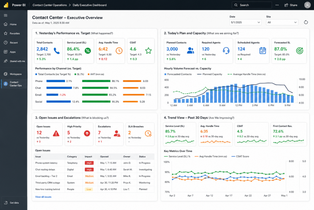
Structure your dashboard to match the meeting agenda:
- Yesterday’s performance vs. target (What happened?)
- Today’s plan and capacity (What are we aiming for?)
- Open issues and escalations (What is blocking us?)
- Trend view for the past 30 days (Are we improving?)
Each section should use consistent color coding: green means on track, yellow means at risk, and red means intervention needed. Keep this color logic consistent across every visual so your team does not have to re-learn the language each meeting. Enable full-screen mode when presenting to remove distractions and focus attention entirely on the data.
Using the Dashboard in the Pursuit of Operational Excellence
A daily huddle dashboard manages the short cycle. But the same data, viewed over weeks and months, drives the continuous improvement work that creates lasting operational gains.
Build a second view or report tab that aggregates the same KPIs over a rolling 90-day window. Use trend lines to identify whether your key metrics are improving, stable, or degrading. Overlay improvement initiatives as reference lines or annotations so you can visually connect actions to outcomes.
This longer view answers the questions that value stream improvement depends on:
- Is cycle time trending down after the process change we made last month?
- Did the new escalation protocol reduce the average ticket age?
- Where is variance highest, and what is causing it?
Power BI’s ability to slice and filter this data interactively makes it far more useful than a static monthly report. In a process review meeting, your team can explore the data in real time rather than waiting for someone to pull a new spreadsheet.
A Note on Governance and Refresh
An operating dashboard is only as trustworthy as the data feeding it. Before you roll out your dashboard to the team, establish:
- Who owns each data source, and who is responsible for ensuring it is accurate and up to date.
- What the refresh schedule is, and whether it meets the needs of your use case.
- How stale data is communicated. If a refresh fails overnight, your team should know before they make decisions based on yesterday’s data.
Power BI Service allows you to set scheduled refreshes and configure data source credentials centrally. For Microsoft 365 environments, SharePoint and Teams-connected data sources refresh cleanly without additional configuration overhead.
Prioritizing Safety and Risk Management in Your Dashboard
You do not need a perfect data model or a fully integrated tech stack to build a useful operating dashboard. Start with the data you have, the metrics your team already tracks, and the meetings where decisions need to happen faster. Build a working version, use it in a real meeting, and iterate based on what your team actually needs.
That is the same philosophy that drives lean operations: start where you are, measure what matters, and improve continuously.
If you are a small or mid-size business in the greater Atlanta area looking to build operational intelligence into your Microsoft 365 environment, TekNation can help you get there. From data model design to dashboard deployment and team training, we bring both the technical depth and the operational experience to make your data work for you.
TekNation is a Microsoft-focused managed services provider based in Douglasville, GA, serving businesses with 10 to 100 employees. We specialize in Microsoft 365, Entra ID, Intune, and business intelligence solutions built on the Microsoft ecosystem.
Ready to build your operating dashboard? Contact TekNation today.